Original Eos Interior Design Alliance
Minimalist deconstruction
This is a 115㎡ L-shaped house in Taiwan Province, with two children living in it. The owner did not want to fill up the room now because the children are still young, and wanted to keep some variability for the future. The original house has some old woodwork in it, and the light is not very bright. The owner hired designer Ming-Hui Cheng of Bug Idea to renovate their home.
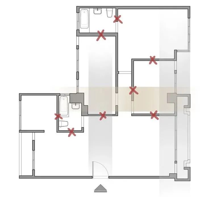
▲Original floor plan
The original floor plan shows that the layout is not good. The corridor is too long and narrow, so the space becomes too long and dark. Firstly, the designer removed the interior partitions and rearranged the three moving lines.
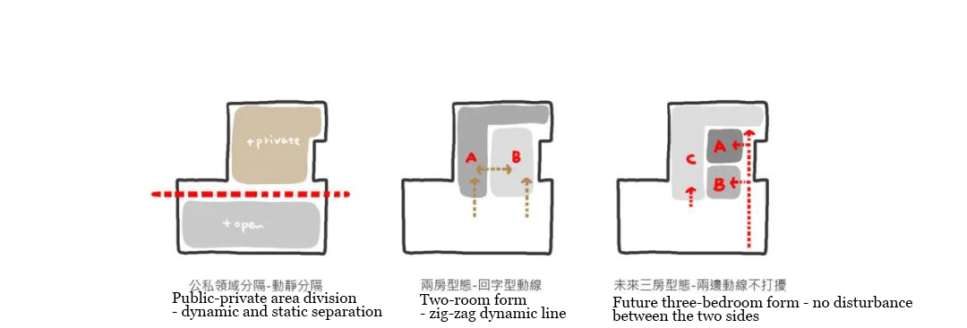
The design of the room is based on the concept of the “L-shaped partition” and the “double line”.
The L-shaped layout is divided into two blocks: the open living room and dining room + kitchen space at the bottom / the room above is the room that needs privacy
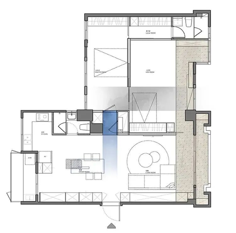
▲Floor Plan
From the whole floor plan, the designer attempted to weaken the shortcomings of the original too long walkway. He connected the upper and lower blocks with a blue block. This blue block is not only the entrance of the room, but also integrates the storage room and storage space. Instead of hiding the door and the wall, this time the “door” is highlighted with a color block, turning it into an interesting transition space.
The upper master bedroom is separated from the children’s room by a sliding door. The sliding door is opened during normal times, so that it becomes a large room configuration. This is convenient for them to play or sleep together.
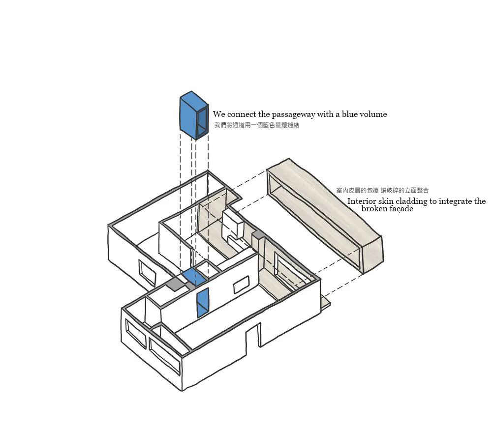
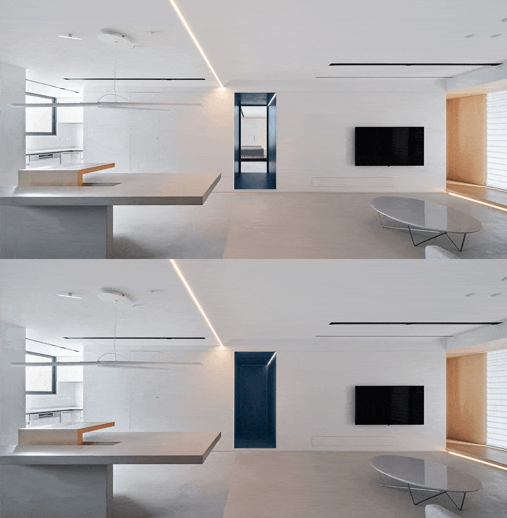
▲The blue volume in the middle connects the upper and lower spaces.

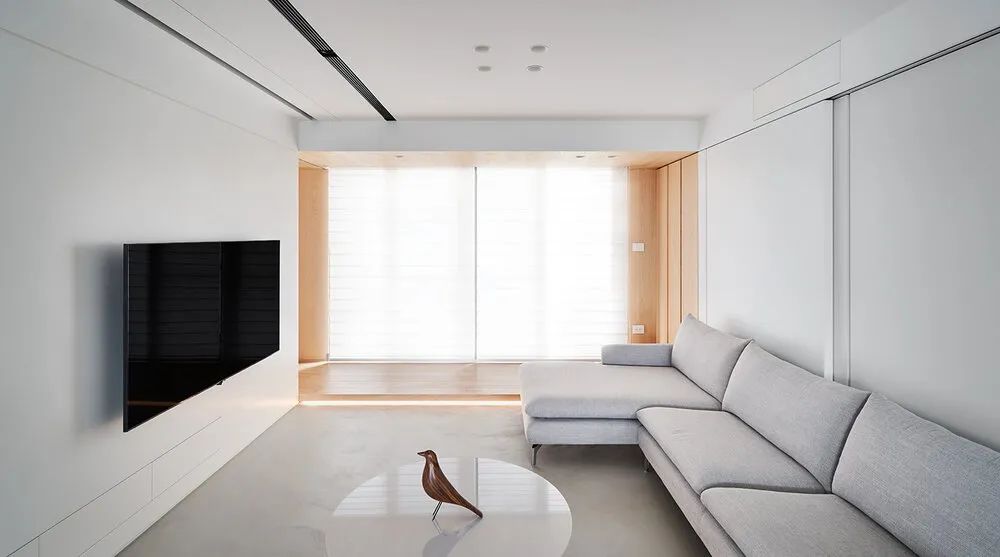
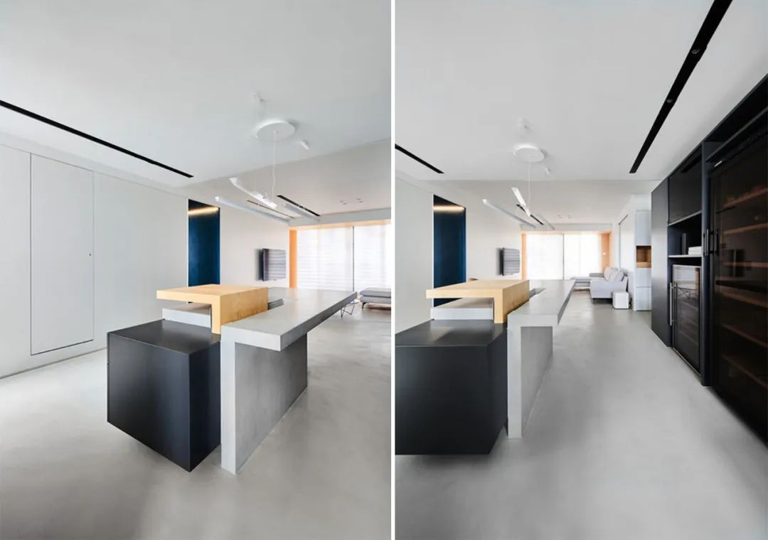
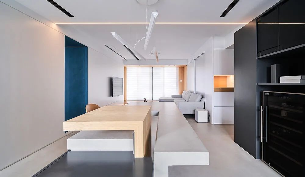
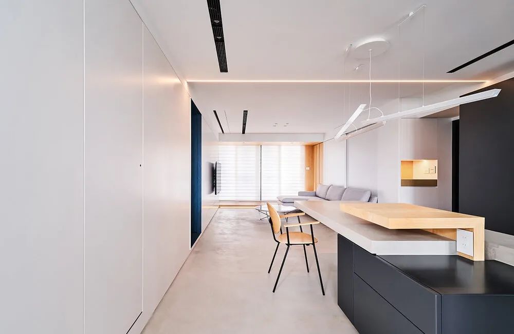
The view from the front door to the interior, the whole space also has a clean and simple tone. The blue space in the middle is a transitional space linking the public and private spheres. The kitchen and dining room are on the left, and the living room is on the right. The storage and storage are all hidden. Behind the sofa is a whole storage room. The TV cabinet is also hidden in the wall. The walkway by the window is connected to the children’s room.
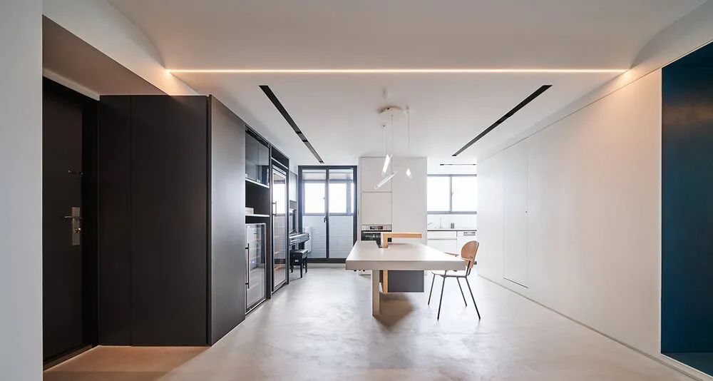
The floor is made of micro cement. On the side of the dining area, a black box is used to integrate the piano, wine cooler and storage cabinets. This way the storage will not look cluttered.
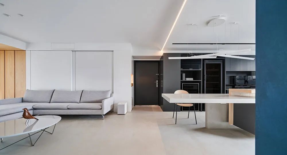
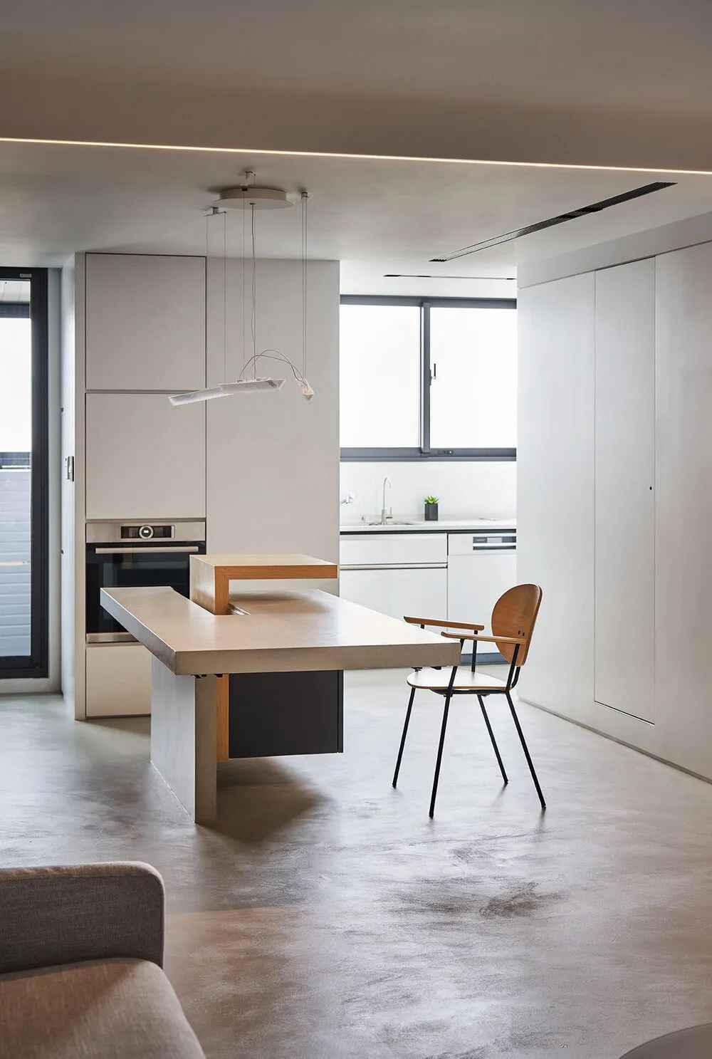
The center island is integrated with the dining table, conceptually using the interlocking elements of volume and board. The floor extends to the table and is interspersed with boxes to form a deconstructed center island table, creating a different way to use it. The hot frying area in the kitchen is placed in the corner, so that there is no need to add a special sliding door, and it can be kept partially open.
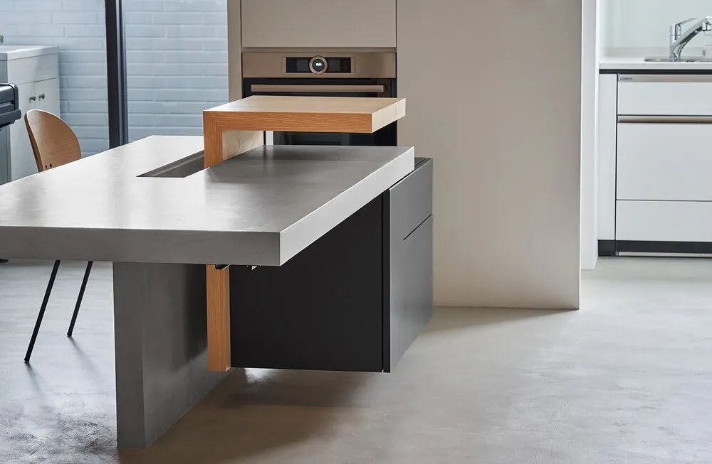
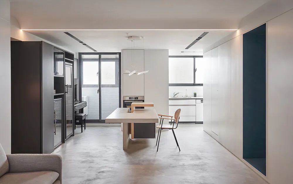
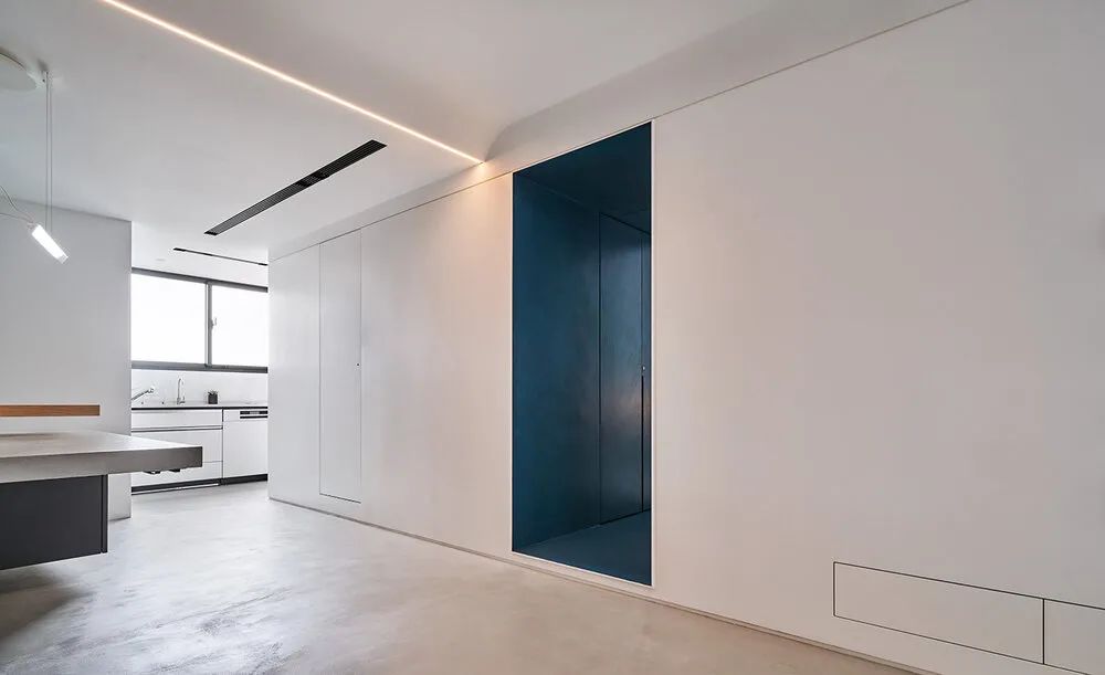
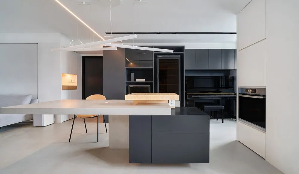
The three colors of gray, black and wood are interspersed. Black is the storage space for appliances. The gray is for the table top, which can also be additionally designed for extension.
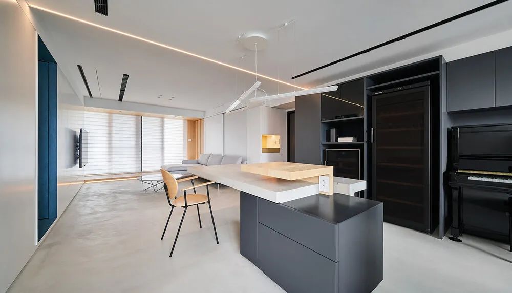
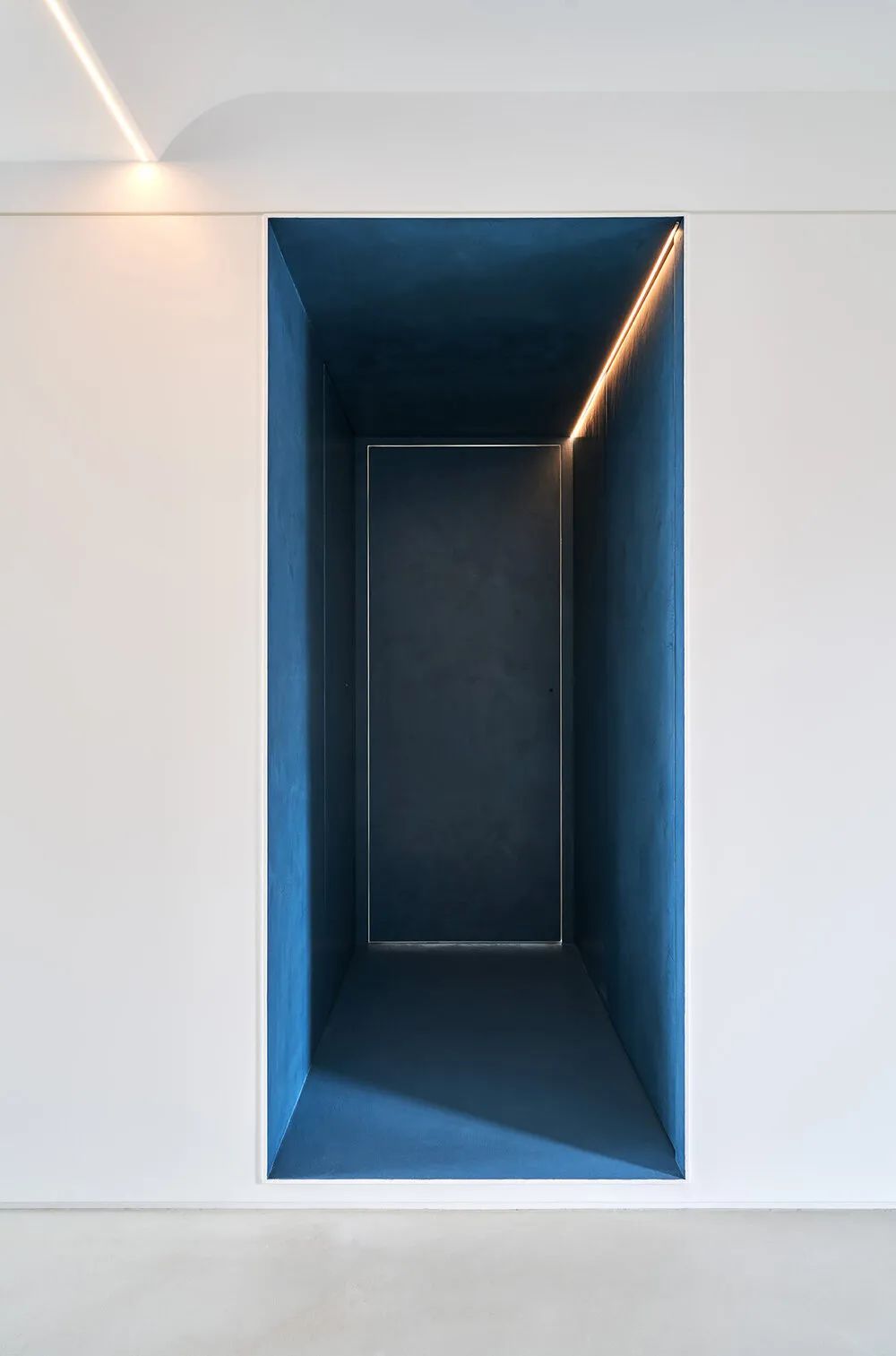
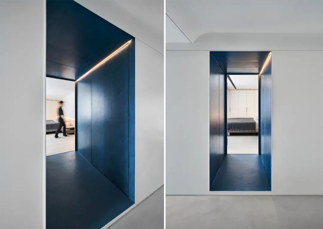
The blue hallway between the living room and bedroom space. One side is a storage room, and the other side is a gun cabinet for the man’s survival game. I hope the owner will get a change of mood when passing through this transitional space.
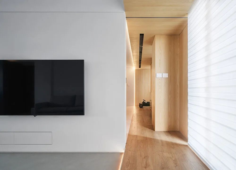
The original irregular façade by the window. The designer integrated it with a wooden block and turned it into the entrance and exit of the children’s room. This creates a bilateral access and solves the problem of long walkways. The block from the living room to the children’s room is set to be a study area for the children in the future.
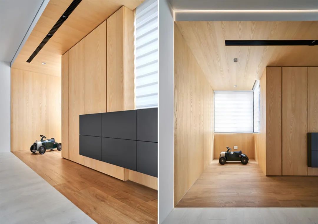
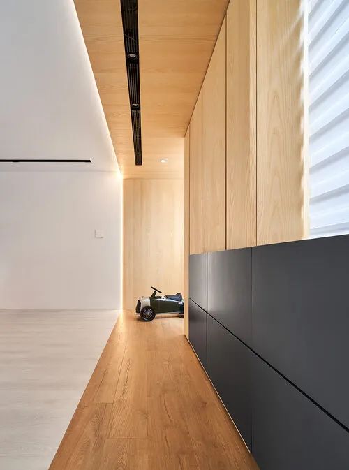
Although the children’s room is now one big room, it is also reserved to be separated into two children’s rooms in the future. This fully satisfies the homeowner’s desire for versatility in life.
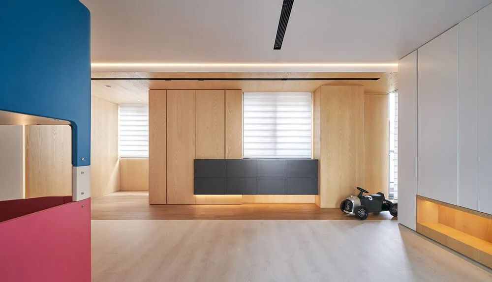
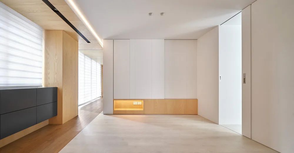
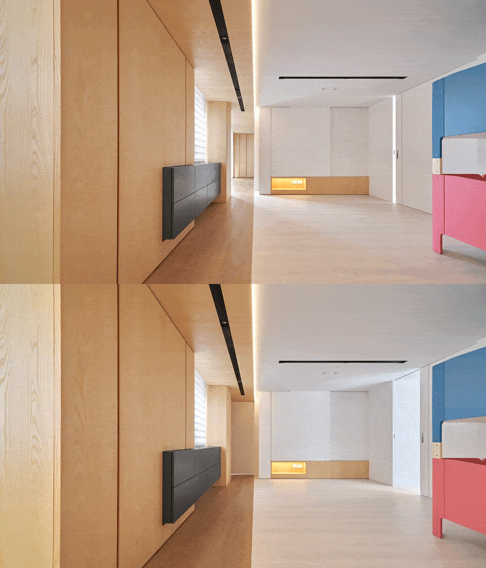
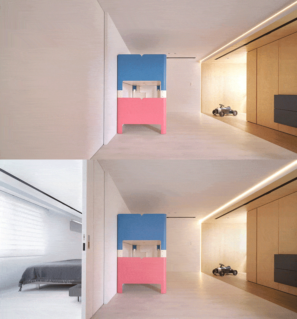
For the current planning of the children’s room, the designer used a bunk bed (this bed can be disassembled into two single beds in the future), so the planning also designed the floor plan configuration five years later.
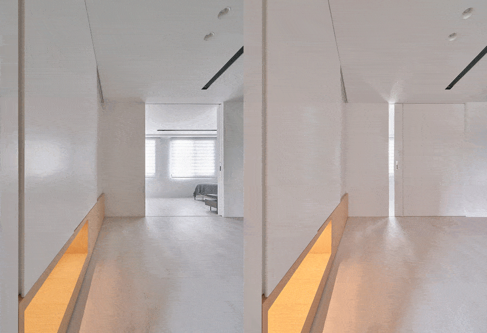
The master bedroom is connected to the children’s room by a sliding door. Since the homeowners spend most of their time with their children, sleeping together or playing together, it is important to connect the children’s room in this way, and many clients nowadays have such a need.
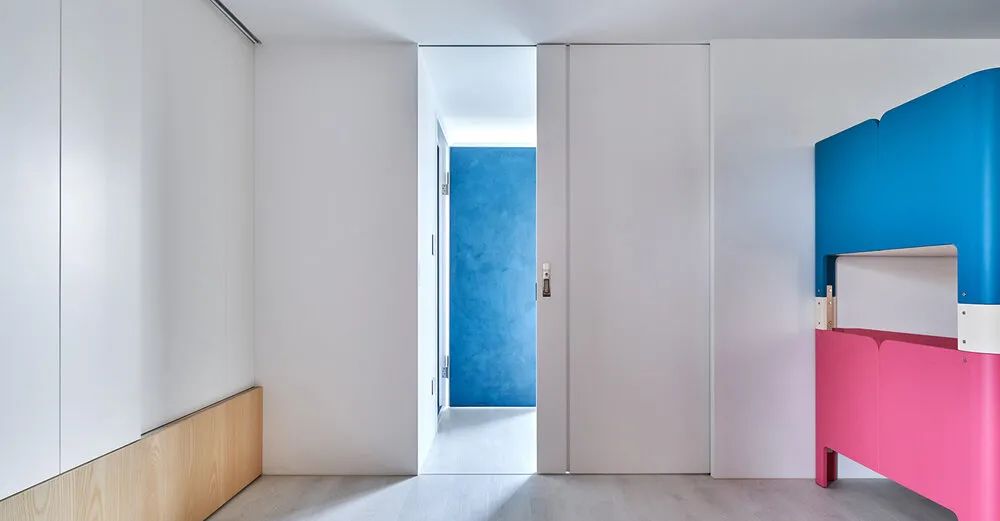
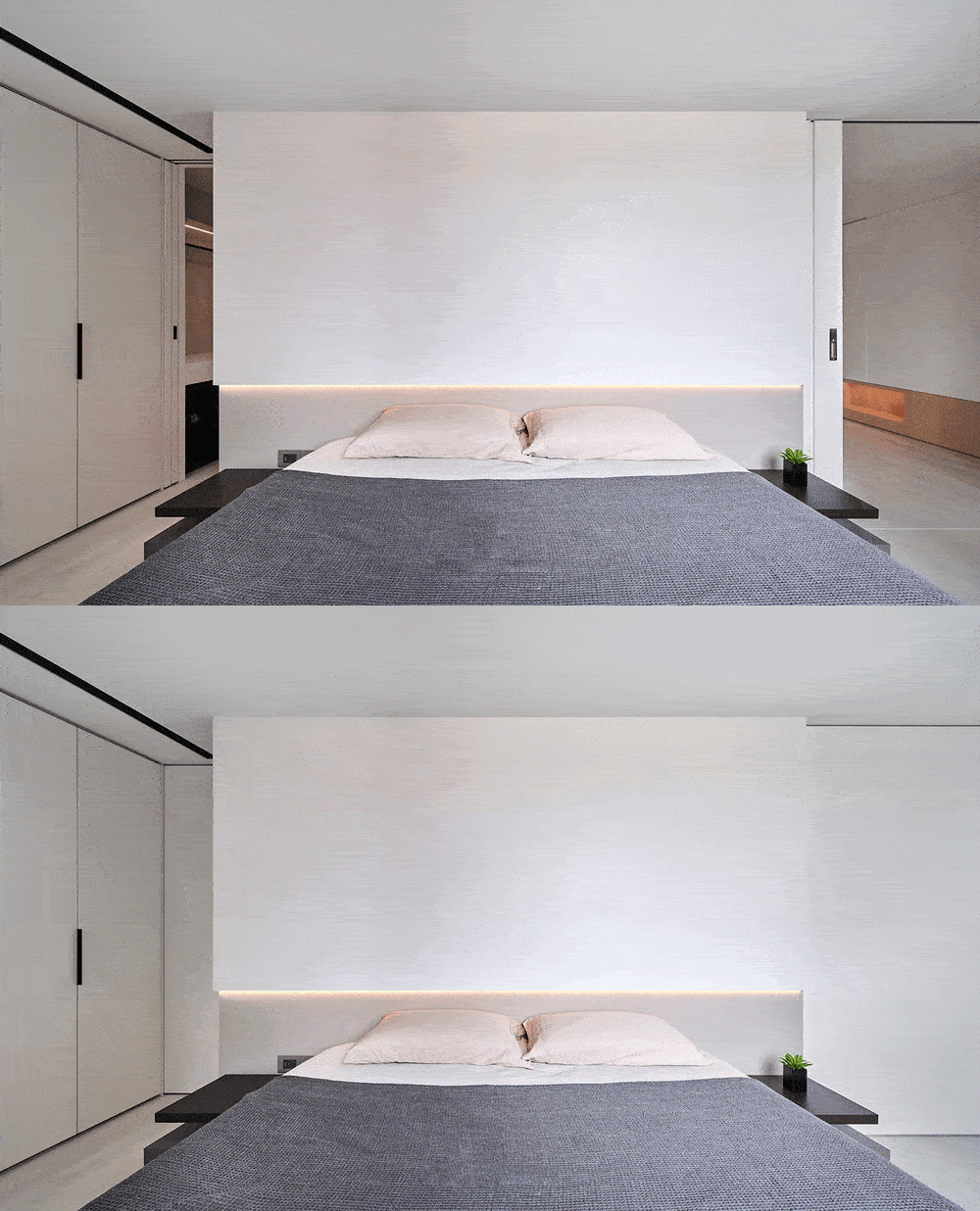
The main bedroom has two sliding doors, one side is the dressing room and master bath, and the other side is connected to the children’s room.
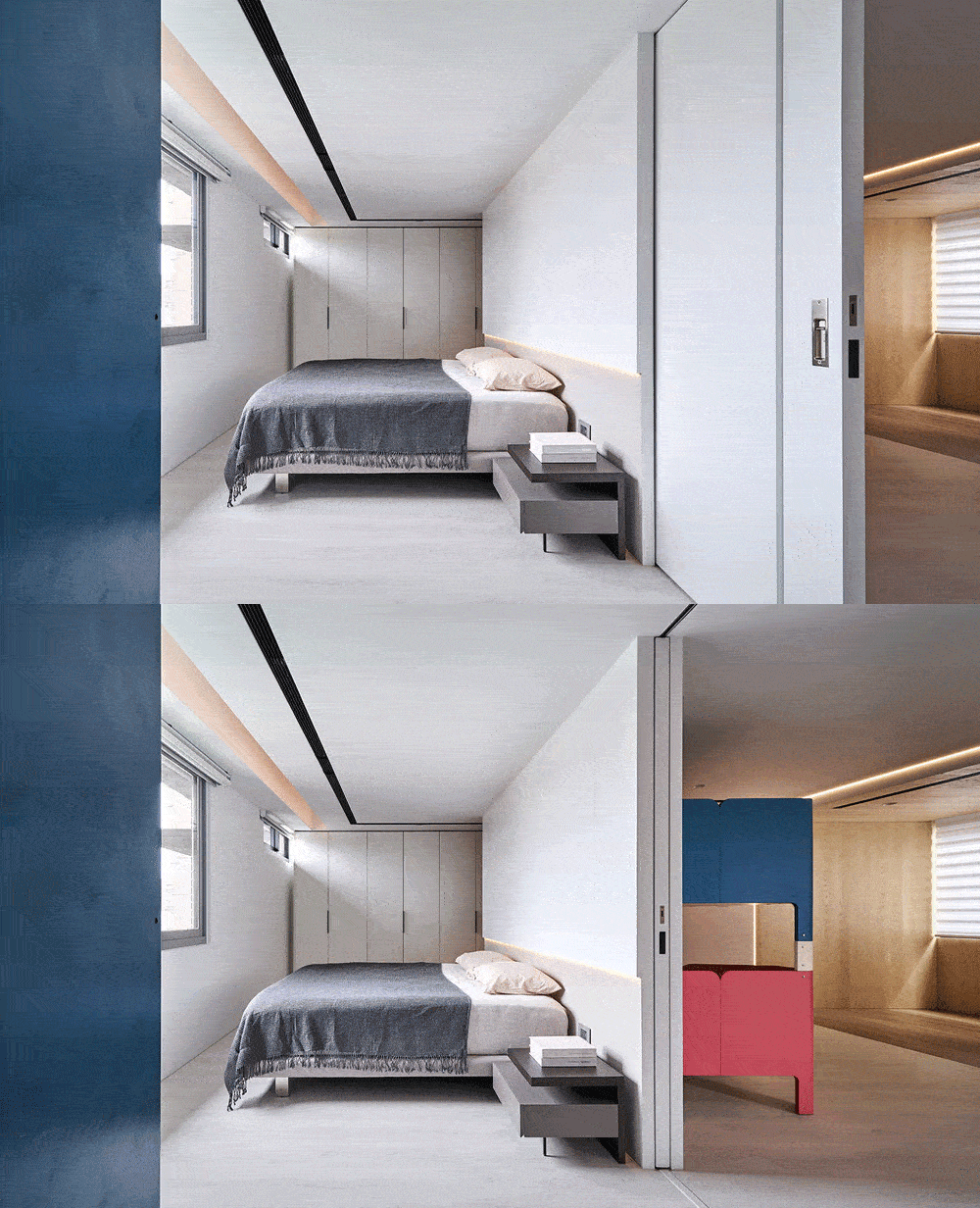
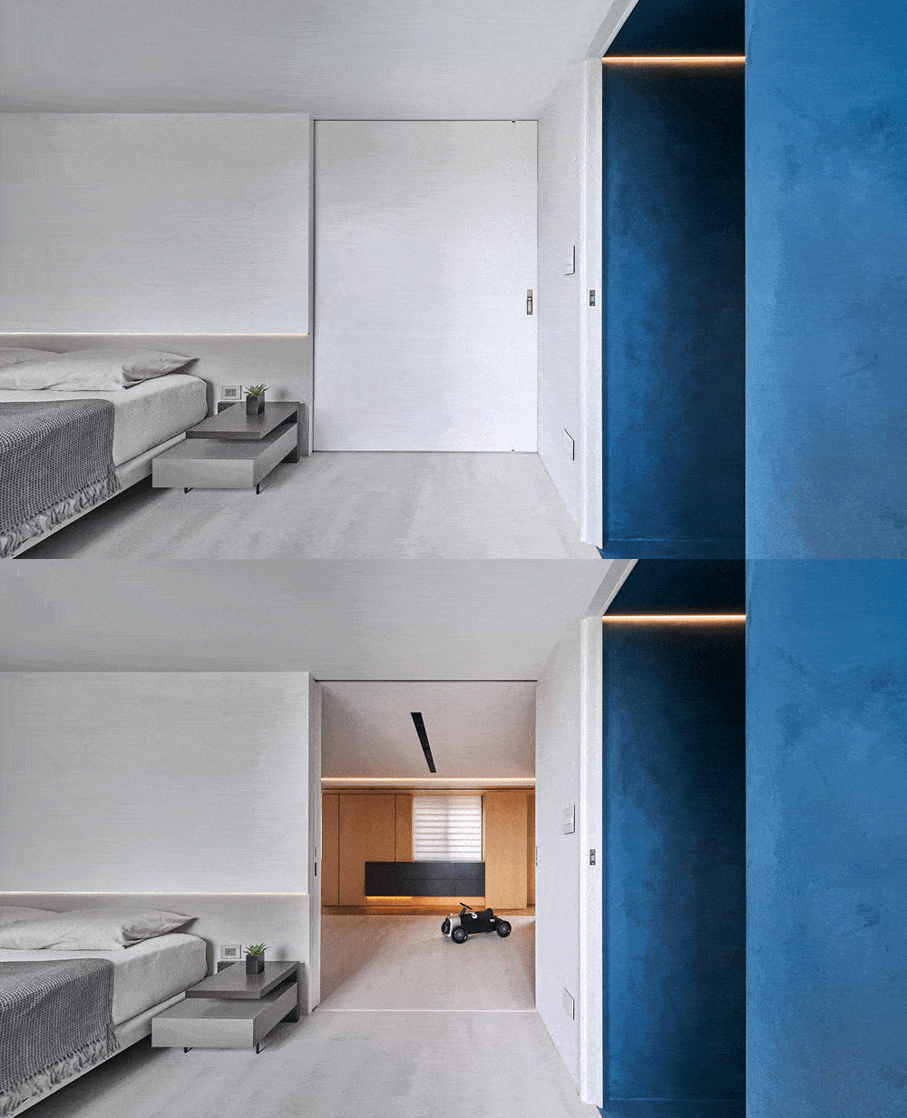
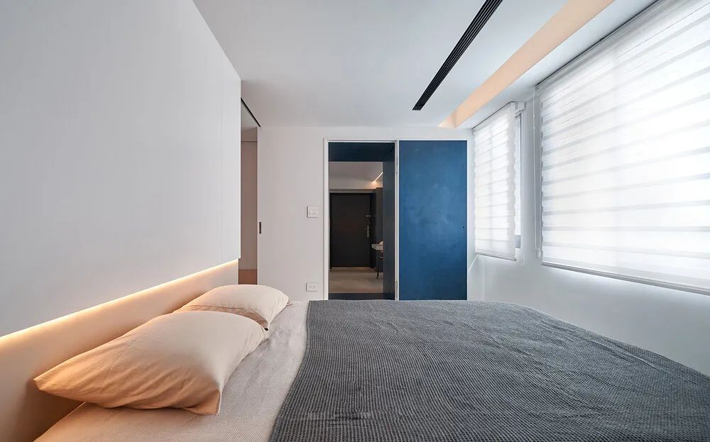
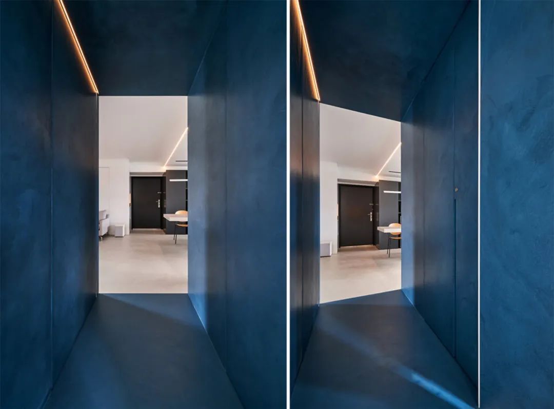
▲The view of the master bedroom towards the living room
The view of the master bedroom looking toward the living room, the deep blue box brings the thoughts to another space.
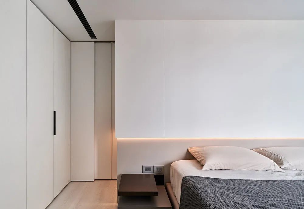
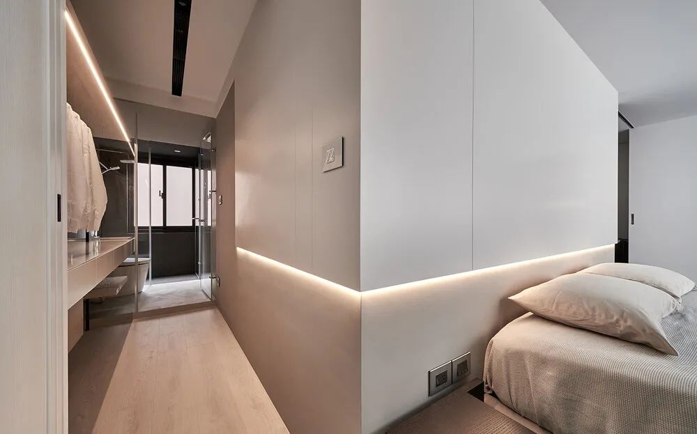
The headboard of the master bedroom extends to the dressing room, and the dressing room cabinet runs through the bathroom sink top, hoping to create a sense of visual extension inside and outside.
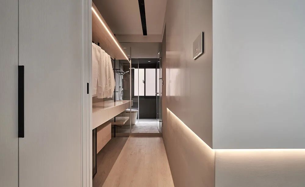
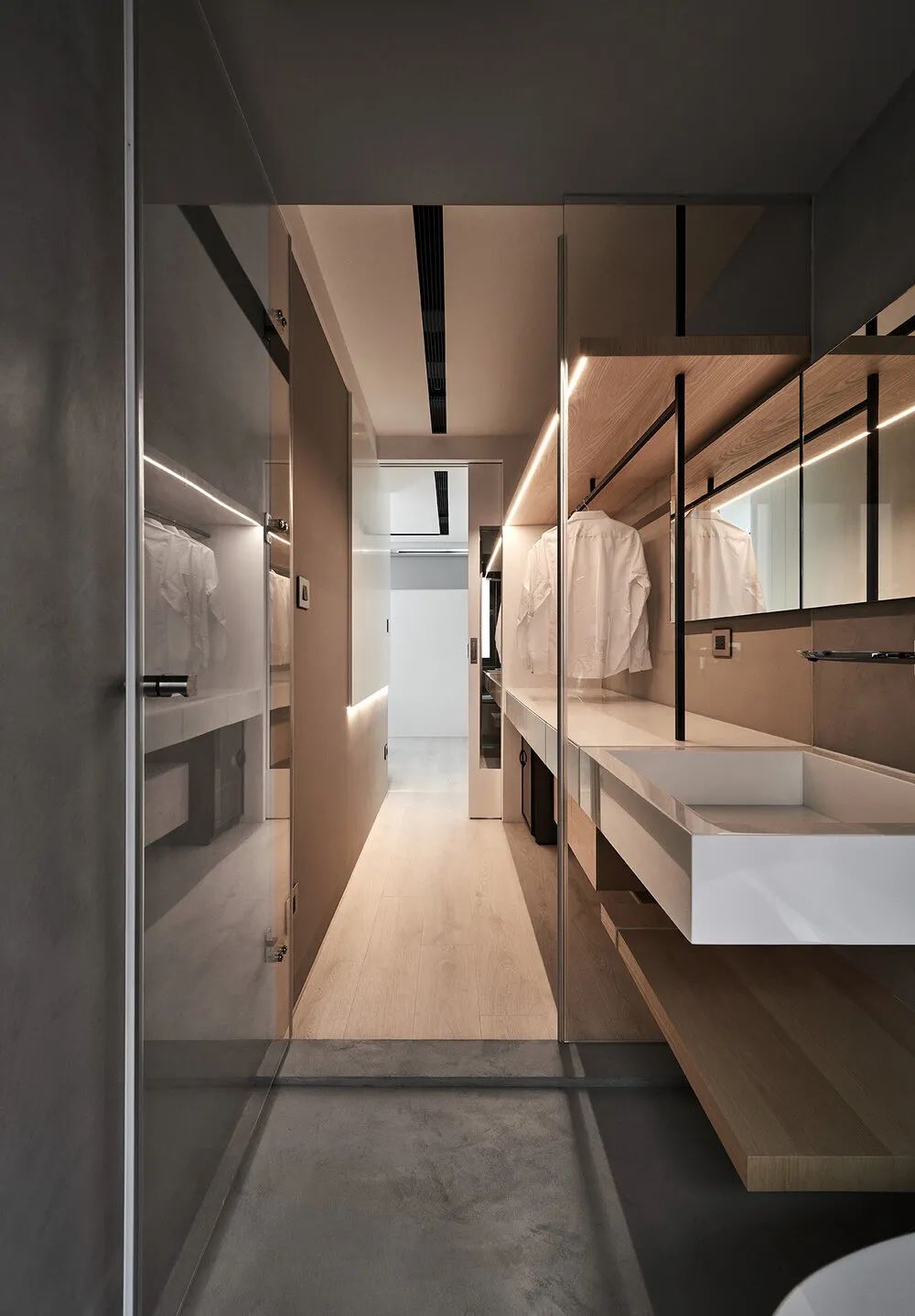
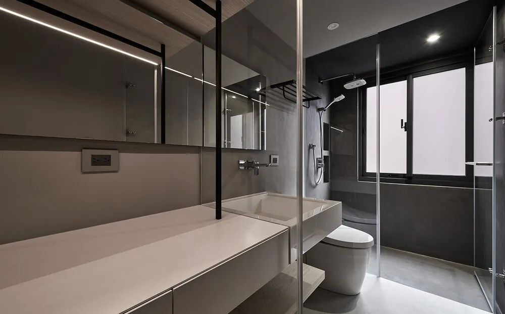
The master bathroom is at the end of the dressing room. The width of the one-line space is not ideal. But after lining up the functional areas, it works well both in use and visually.
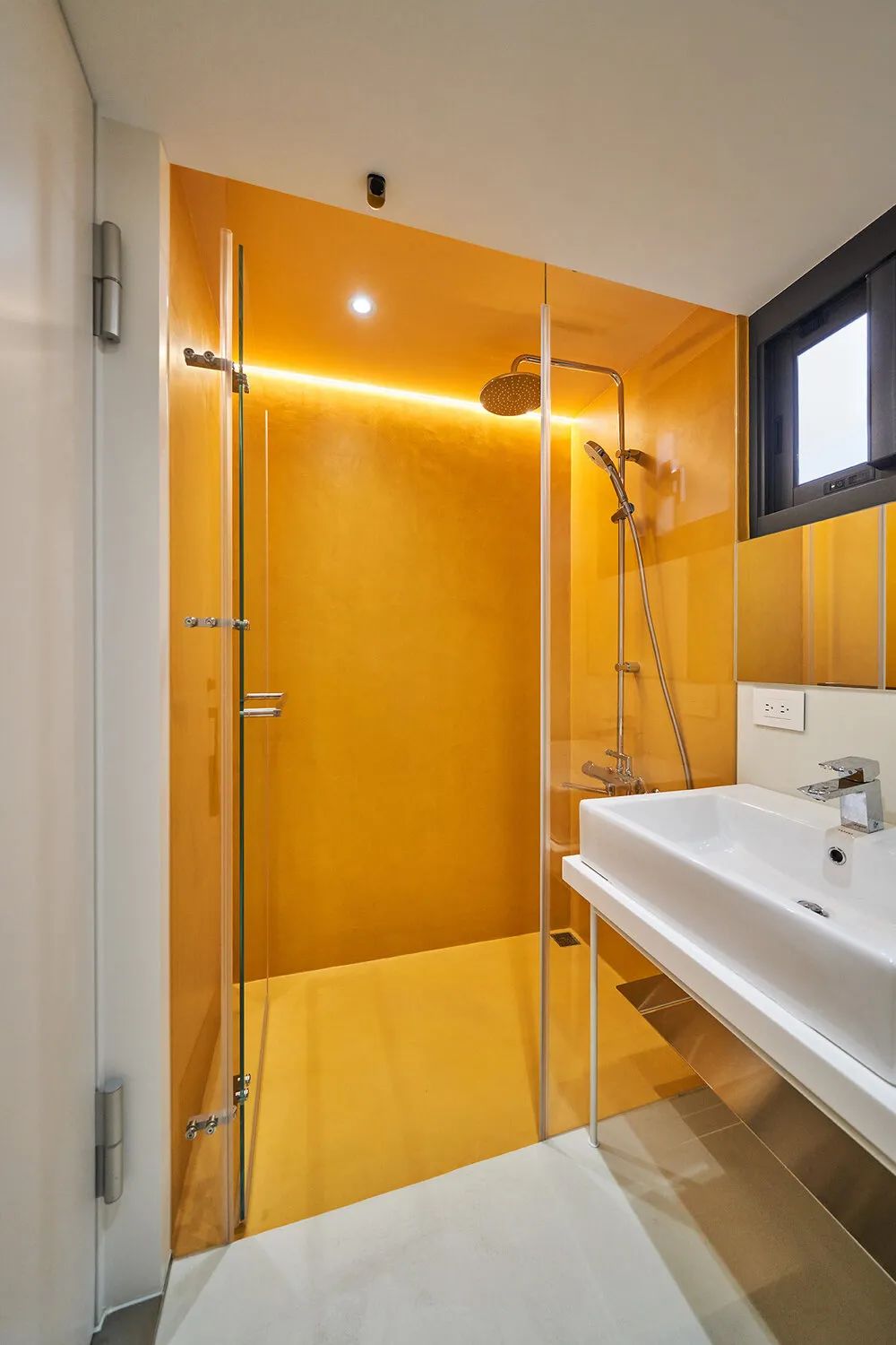
The shower area of the public bathroom is separated by mineral paint. The warm yellow color shows the warmth and hospitality of the owner.
 WOWOW Faucets