White Design Interior Design Alliance

This is a family of five, the owners of the house are a couple of engineers, the couple is usually busy with work, often travel, long-term parents and children living at home. The couple are rational activists and like simple and clean design. For home expectations, they hope that the home environment is free, cozy and warm, without the need for redundant decoration. When they return home after a busy day, they can enjoy the freedom and warmth of home, which is a recharge station for their body and mind.
Homeowner needs: 1.
- Three bedrooms, a desk in the master bedroom and a desk in the children’s room, are needed because the parents are taking care of the children due to their busy work schedule.
- The main activity space for the couple wanted to be separate from the living space for the elderly and children, so that the children and parents would not be disturbed when they returned late after working overtime.
- I like the simple and clean design, but at the same time, I hope I can spend more time with my family in a warm family environment.
- Need enough storage space.
01
A LIVING ROOM
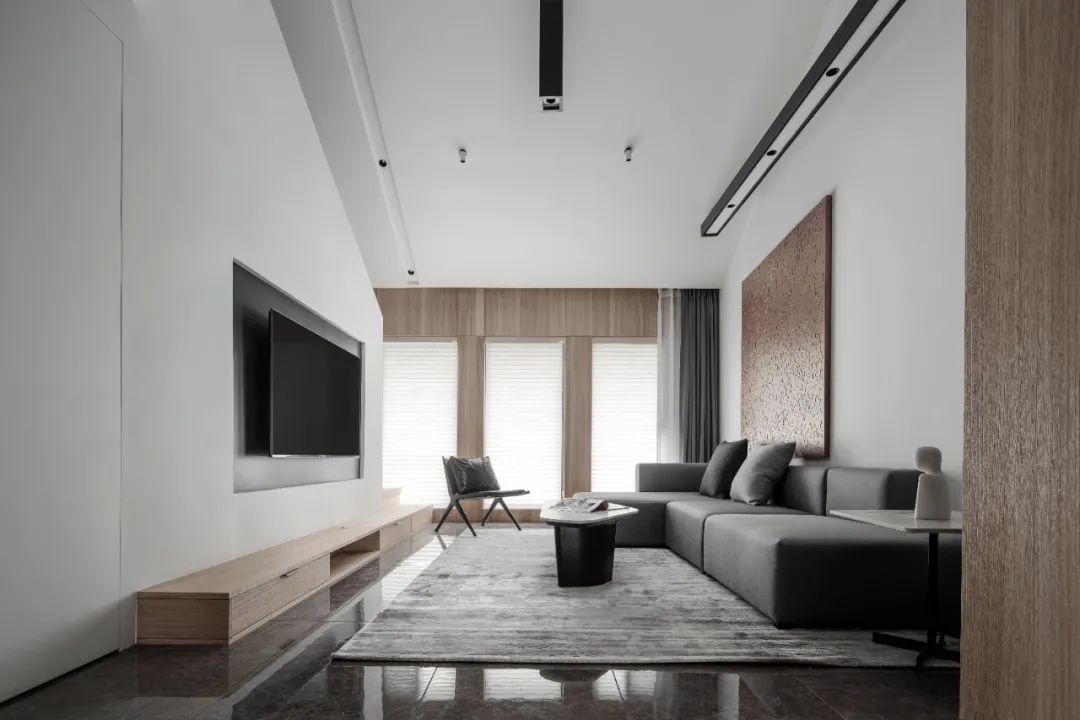
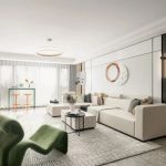
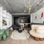
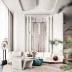
Black, white and gray is the main tone, simple tones exude elegant sophistication, and the integration of wood grain color is more in line with nature, adding warmth to this simple space, giving life to the space. The open floor height, the large white wall and ceiling, and the design of no main light make the space more comfortable visually.
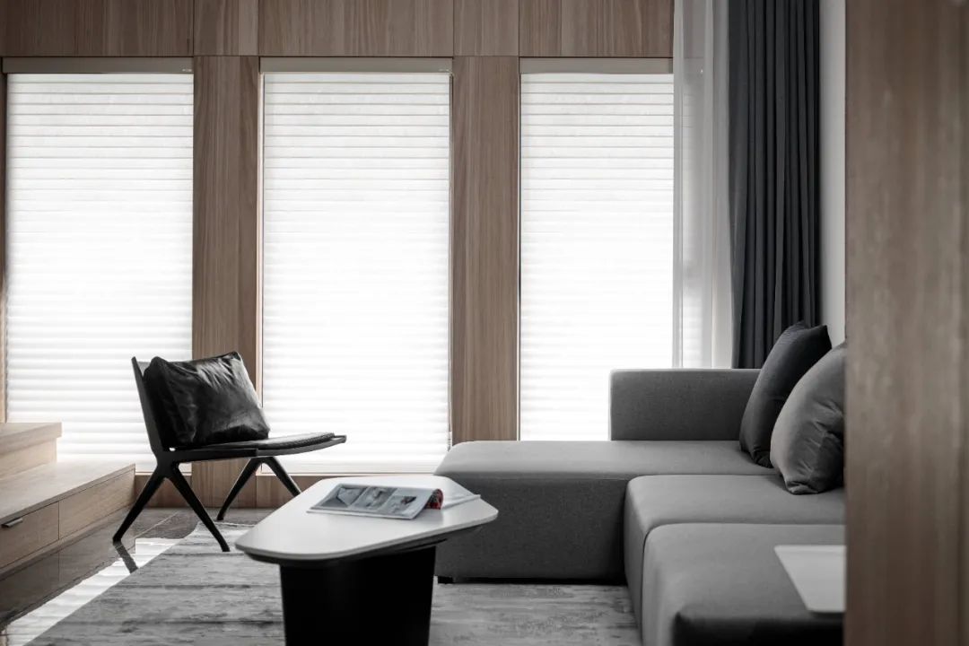
The spacious floor-to-ceiling windows shed sufficient sunlight, with blinds, the addition of natural light makes the space more soft and warm, and the restful atmosphere spreads around.
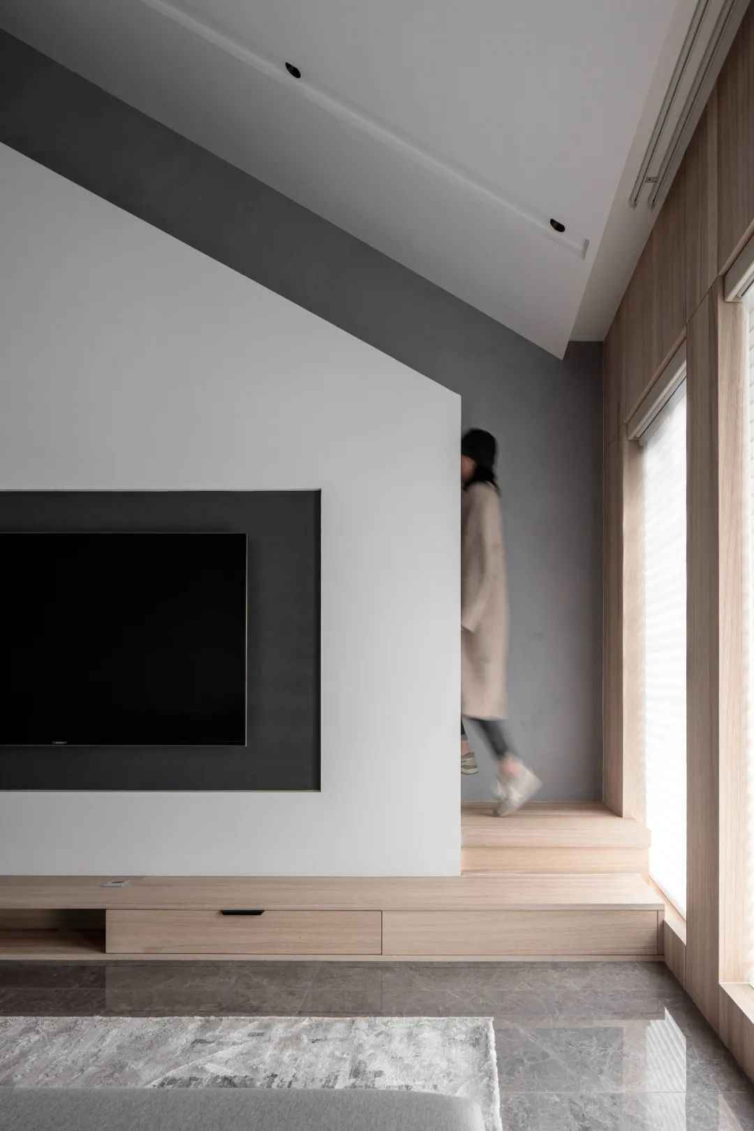
The TV cabinet is connected to the staircase, becoming a whole, and the wooden staircase is rich in texture. The upward staircase is parallel to the upward top, appealing to each other and bridging the space.
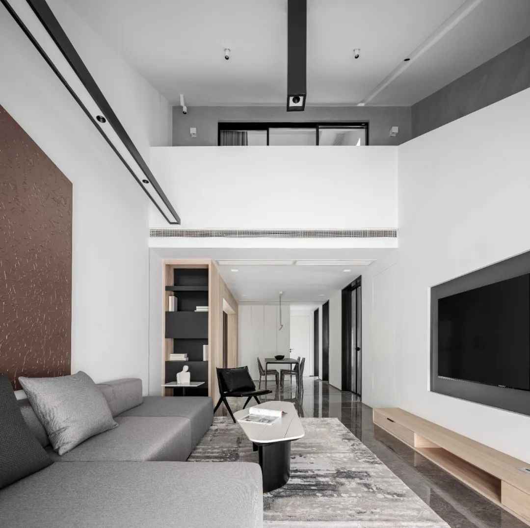
The living room retains the original high-ceilinged area, and the vertical surface of the space is extended to create a perfect combination of surface and line, which enriches the art form and gives the simple space a multi-level change. The layout of simplification creates a quiet and comfortable environment.
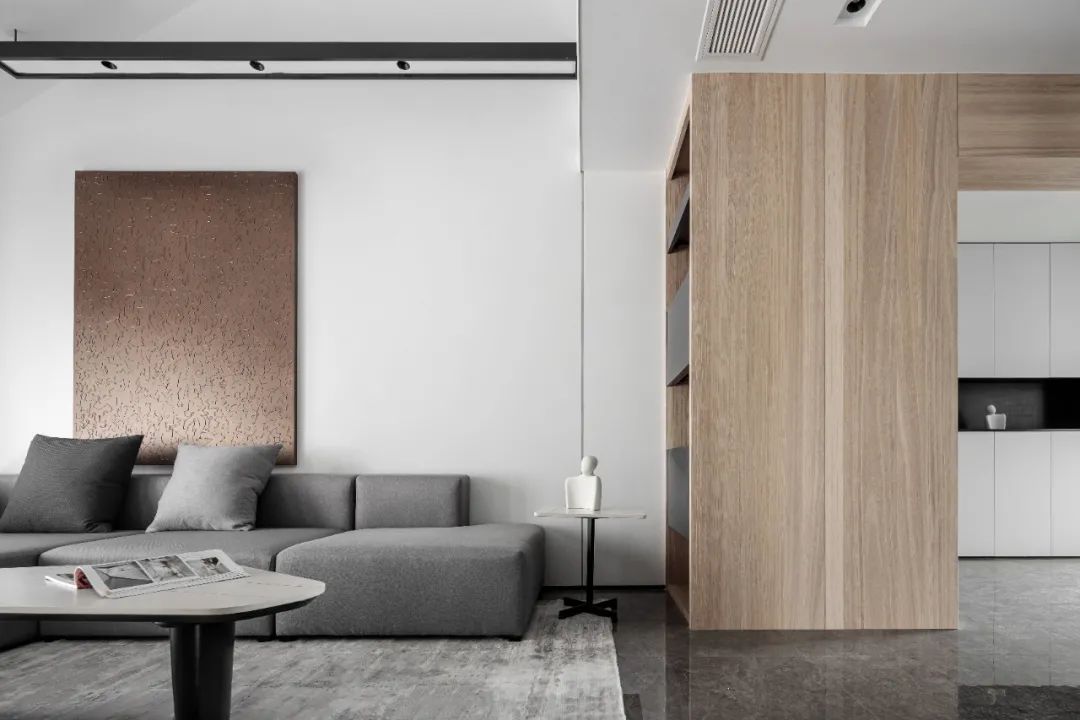
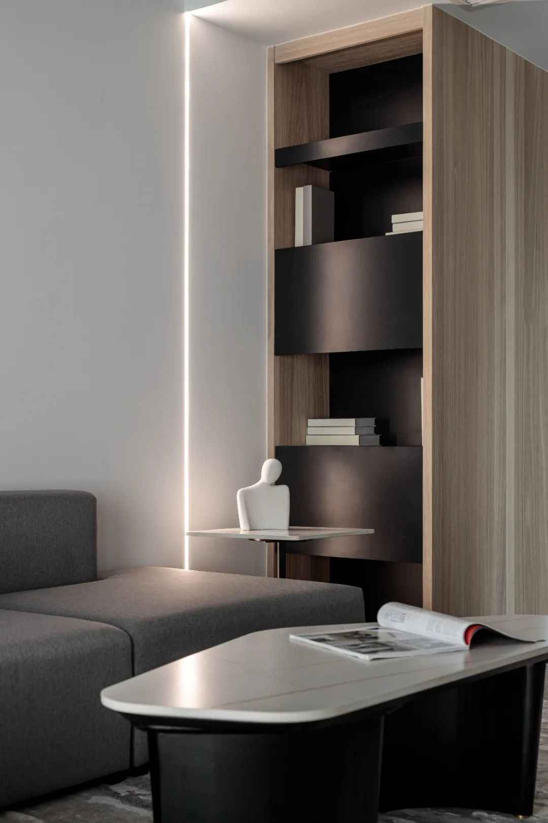
The warm and smooth lines penetrate through the space, and the wooden blocks bring warmth to the whole space, which also serves the functions of storage and bookcases, and at the same time, it is like a wall that can realize the mutual coherence of space and also constitute the mutual separation of space.
02
RESTAURANT
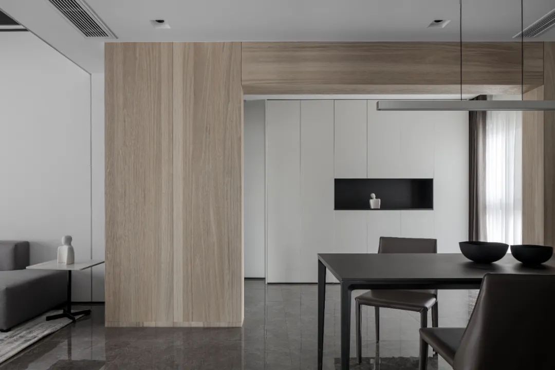
The dining room as an extension of the living room also continues the uniform color, the wood finish separates the entrance and dining room, and the original staircase at the entrance is removed so that the light can fully enter the room. The entrance hall is made with sufficient storage space, and the strong contrast between black and white in the space enhances the sense of simplicity.

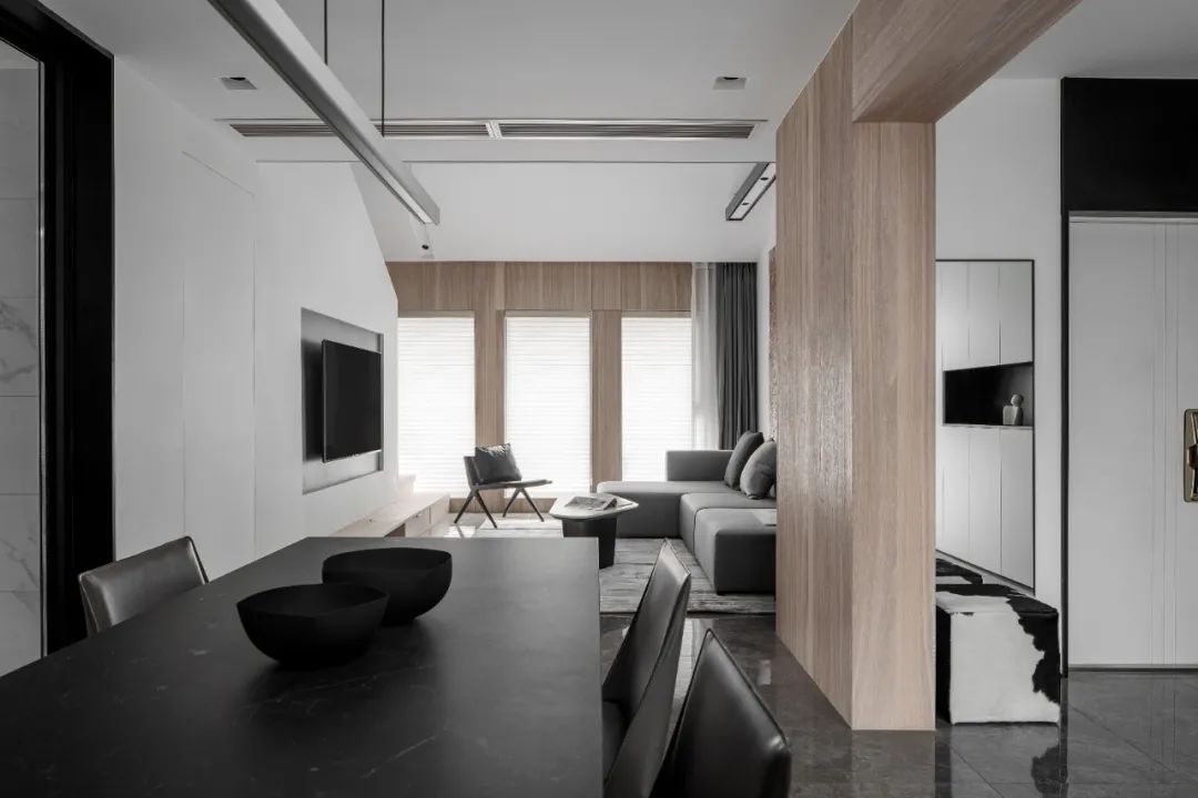
The open layout divides the space into entryway, living room and dining room, which enriches the overall space level and gives people an open view, while increasing the interaction between families. A dressing mirror is placed on the left side of the entrance to facilitate dressing when going out, and a black and white shoe changing bench echoes the overall color of the space.
03
CHILDREN’S ROOM
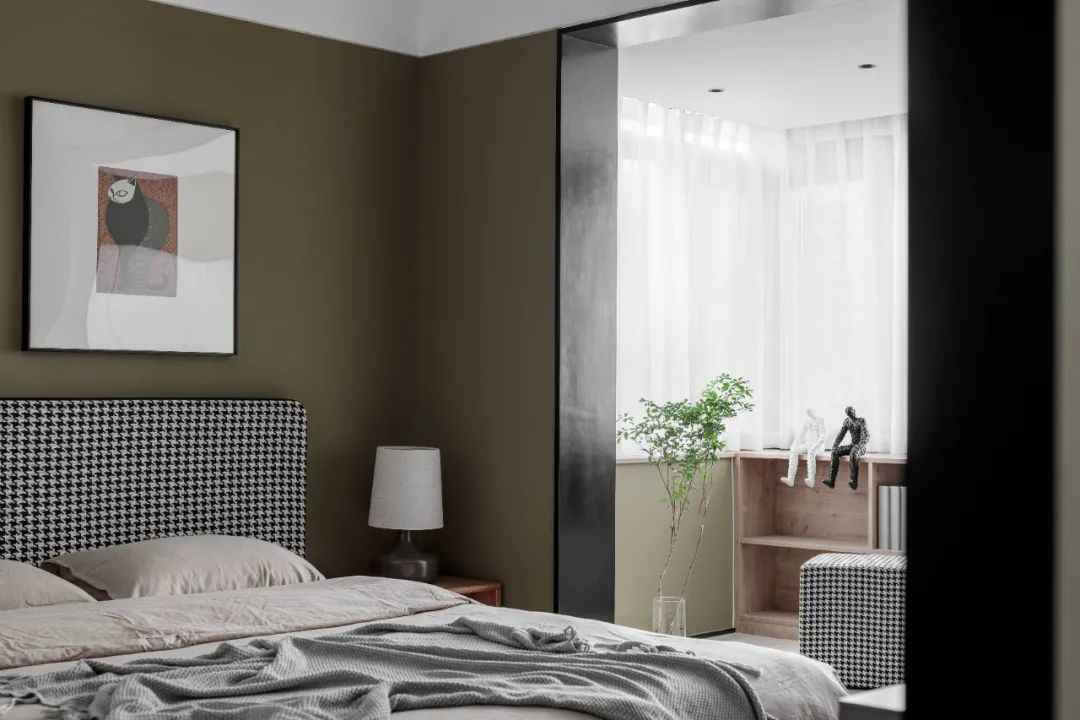
This space is currently used mainly as a study, but the owner can change the function to use it as a children’s room according to his needs. The olive green paint on the wall is full of vitality and adds a different color to the house.
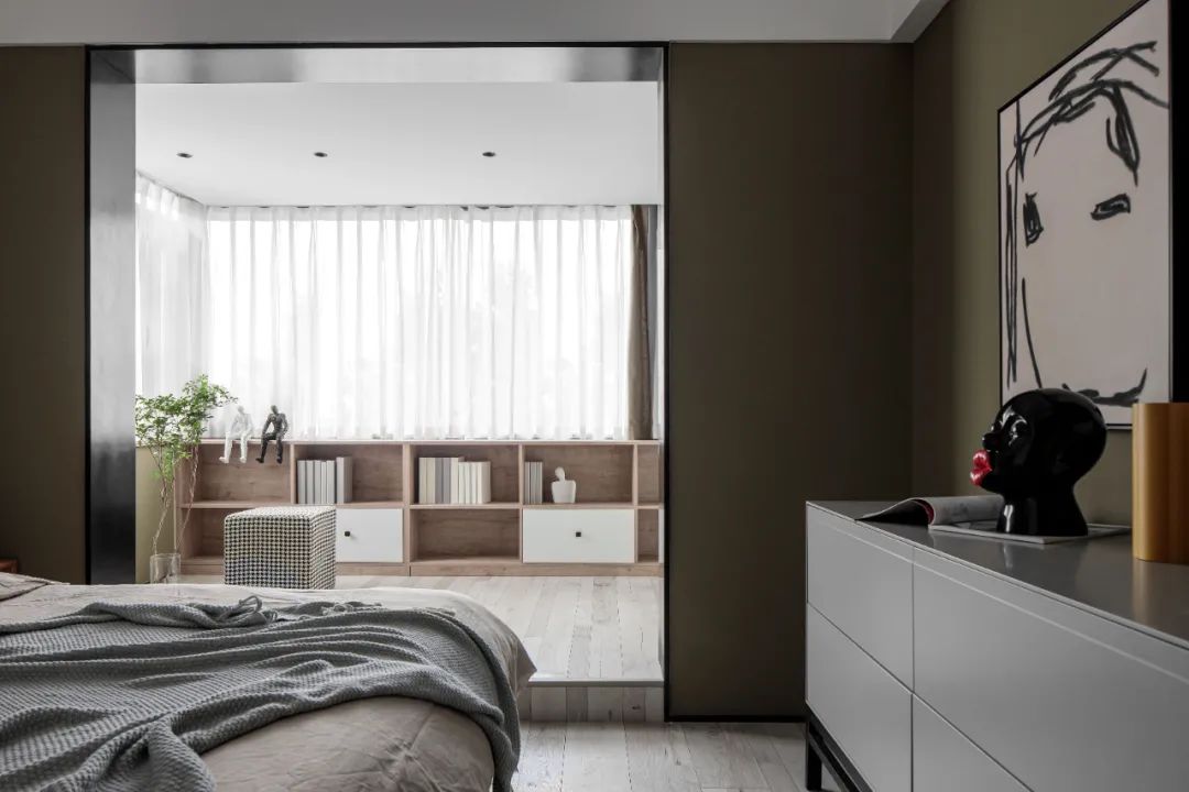
The balcony is a multi-functional area for reading and relaxing, and the bookcase is made under the window, so that the afternoon sunlight becomes soft through the screen curtain. With a cup of tea and a book, you can enjoy your leisure time here. The playful ornaments and illustrations at the end of the bedroom bed bring fun to the space.
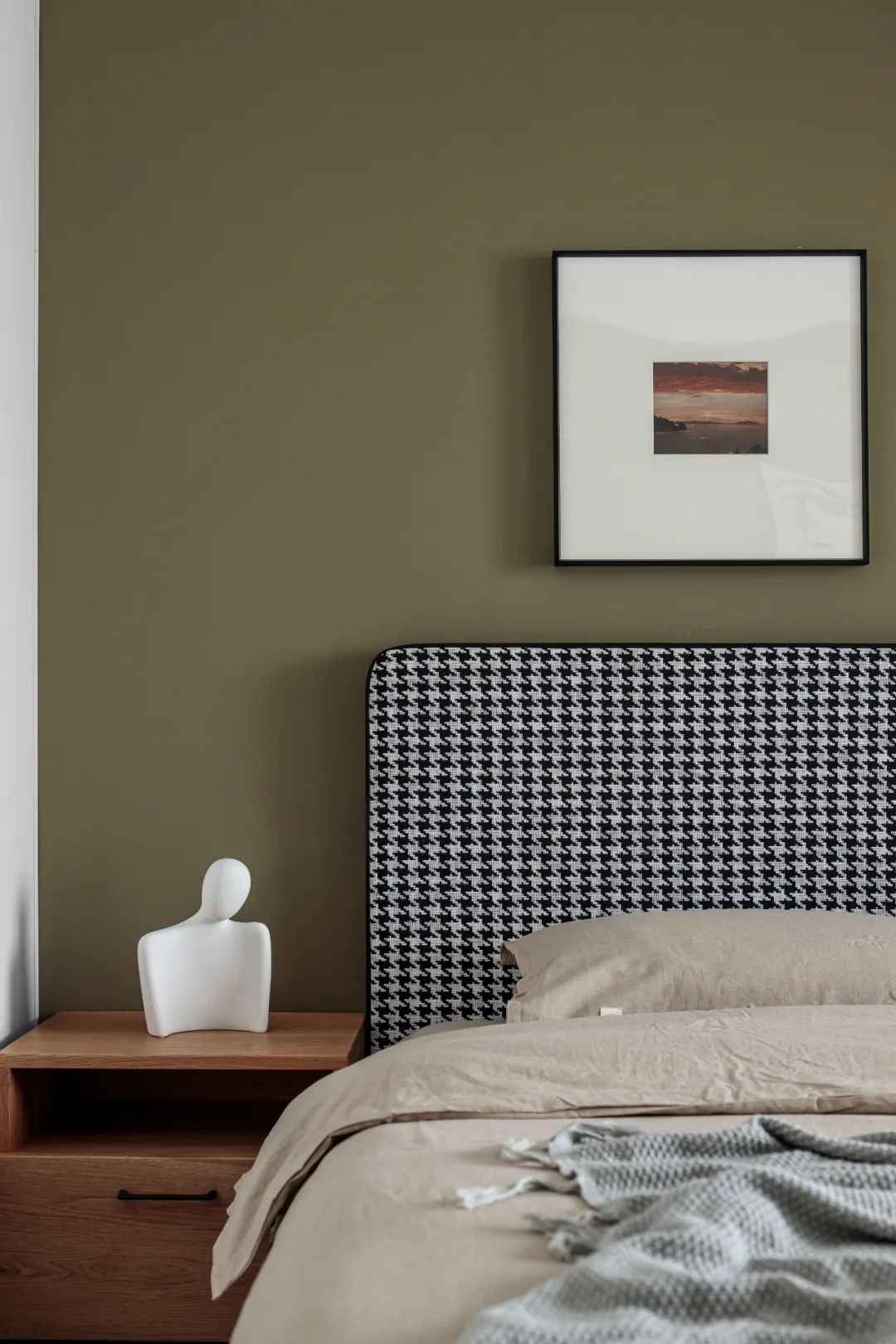
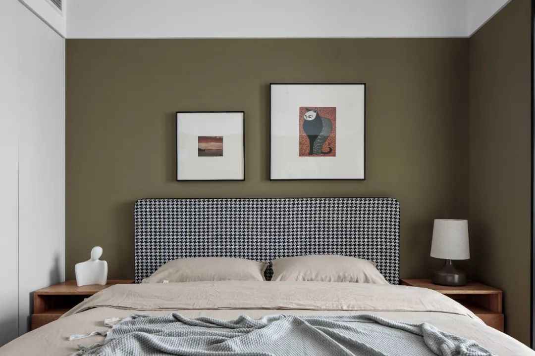
Considering that it may be used as a child’s room in the future, enough storage space is reserved. The classic black and white bird check with childish wall paintings above the bed reveals a touch of liveliness in the advanced space.
04
HUSING FOR THE ELDERLY
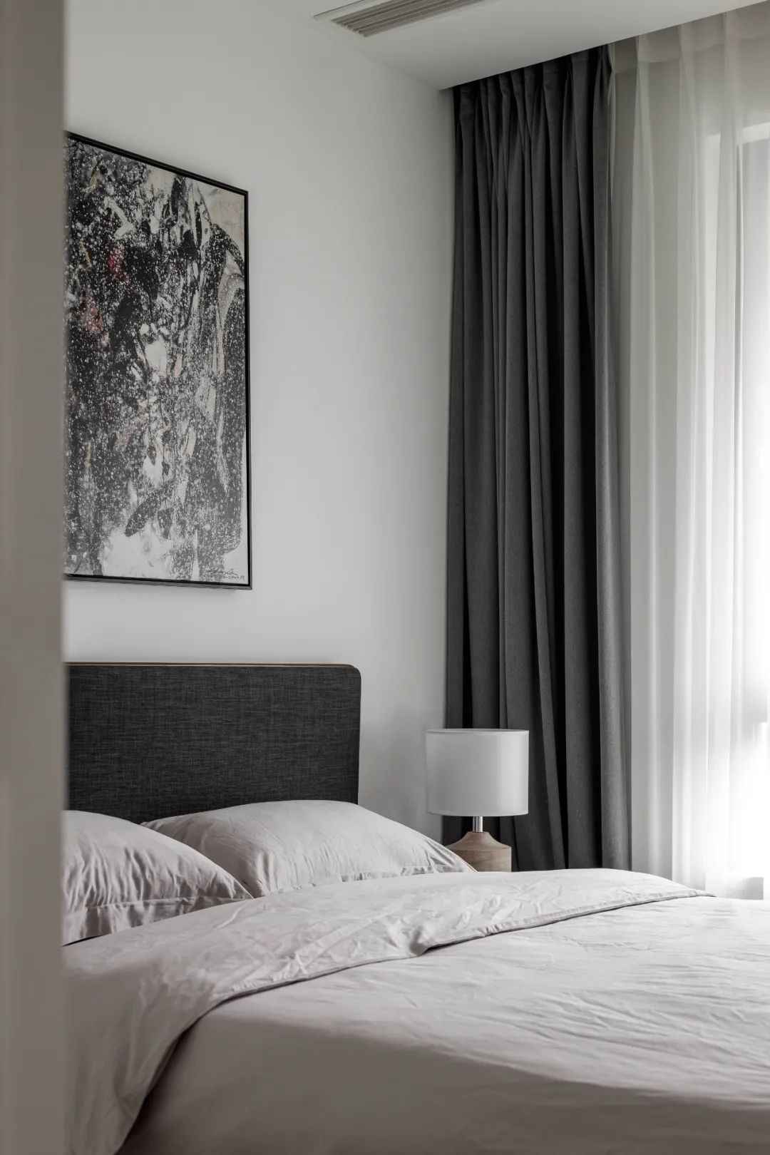
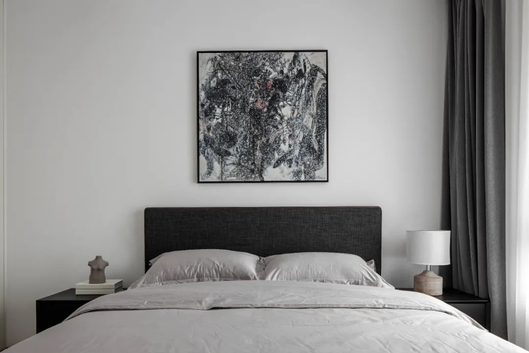
The elderly room without excess decoration and excessive furnishings, and young people are not the same. The old people prefer calm and atmospheric colors, black and white gray with a light and elegant. The simple decoration of the plain space reflects a static passage of time.
05
MASTER BEDROOM
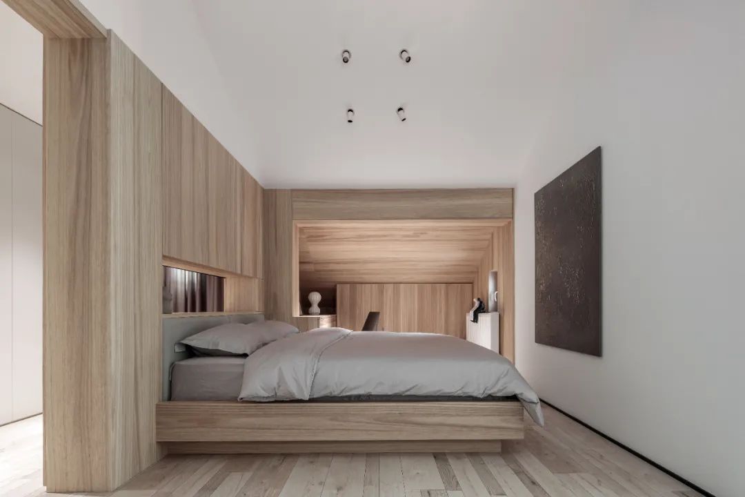
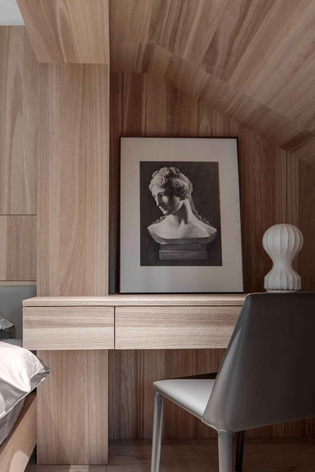
The master bedroom continues the elegant and light tone, with a large area of primary-colored wood extending all over the space. The natural grain texture of the wood and the warm texture are very easy to give people an intimate feeling, eliminating the monotony of the modern minimalist space, and making the space vibrant while being warm and comfortable.
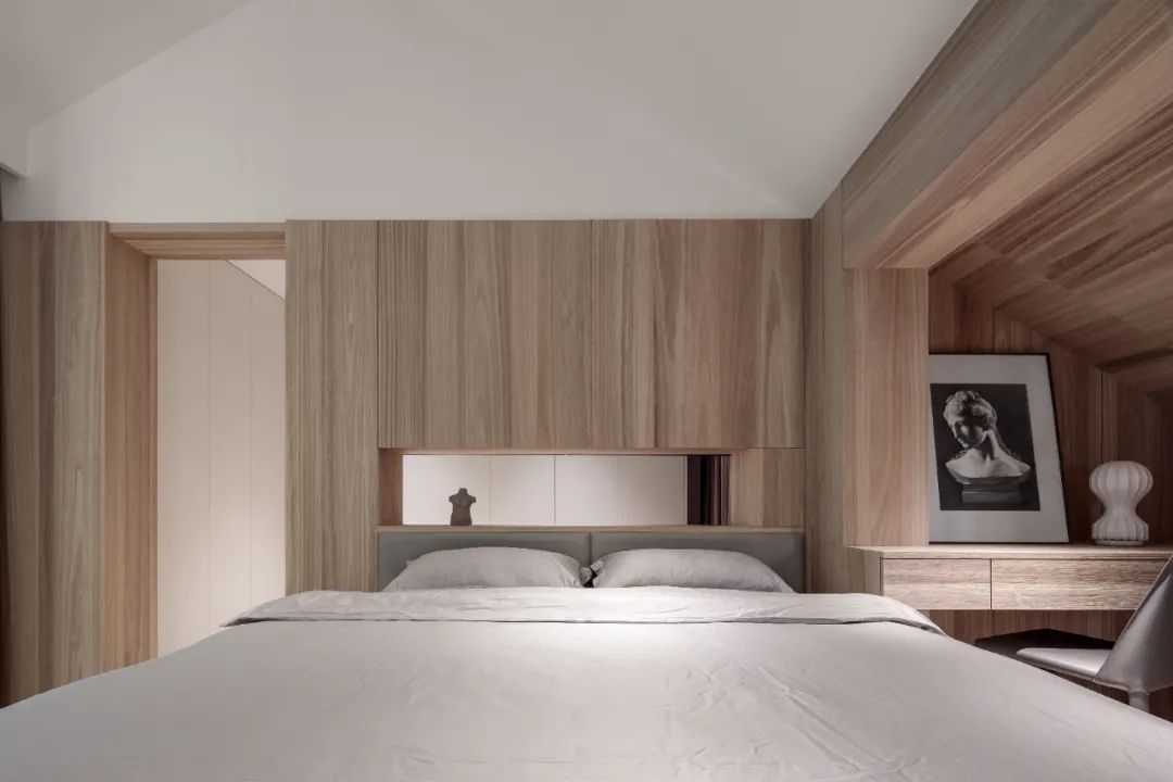
The master bedroom and the closet are separated by cabinets to increase the storage space, and the cabinets are hollowed out in the middle, thus replacing the function of the rigid bedside table.
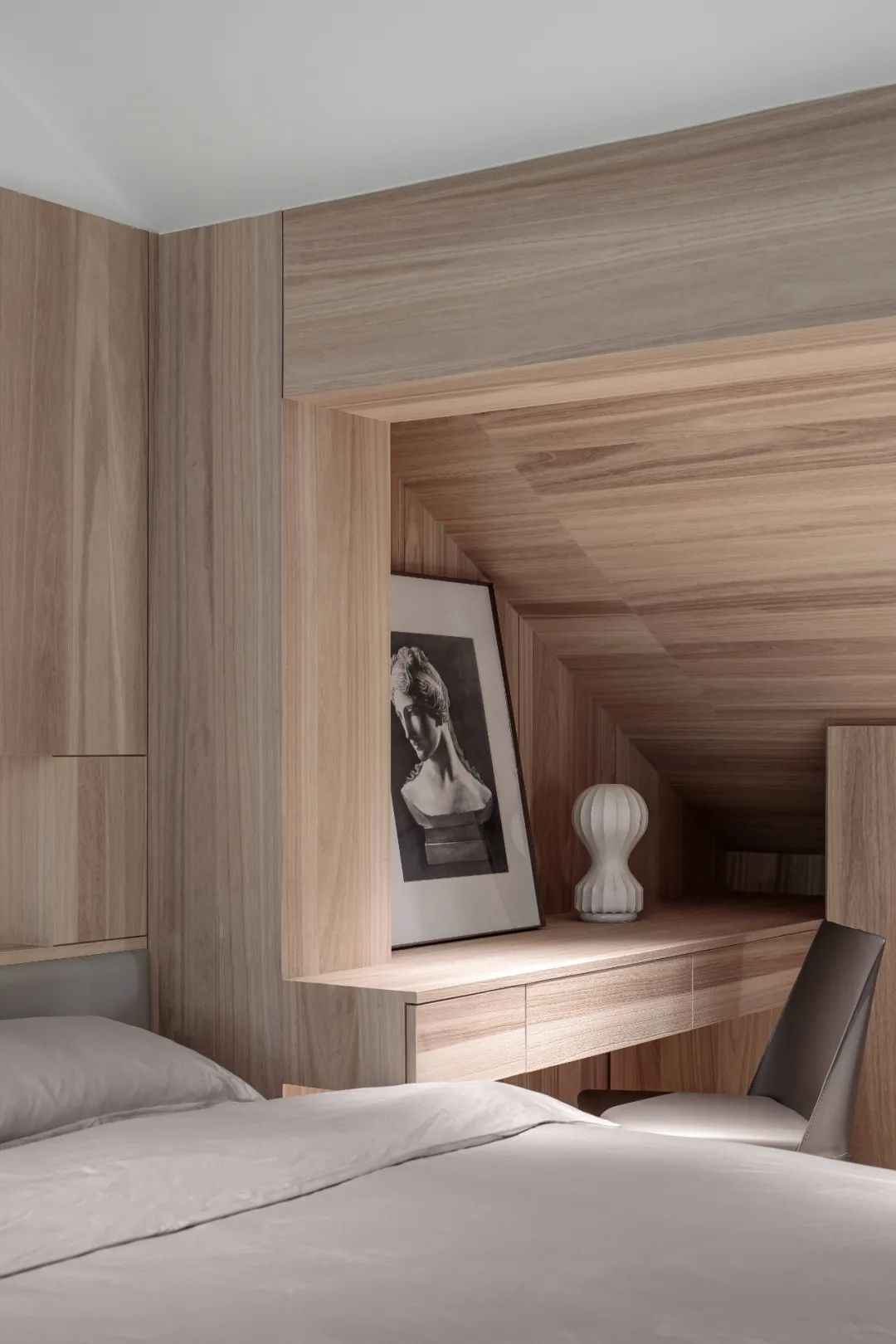
The space under the original slanted ceiling was used to create a multifunctional cabinet, and the desk was extended to connect the cabinet, meeting the basic functional needs while connecting the space into a whole.
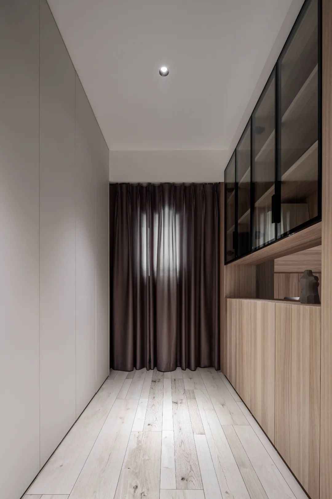
Too much wood grain color may cause the space to become crowded and boring, making the cabinet on the left side white, the visual overhead also becomes simple and transparent.
06
KITCHEN
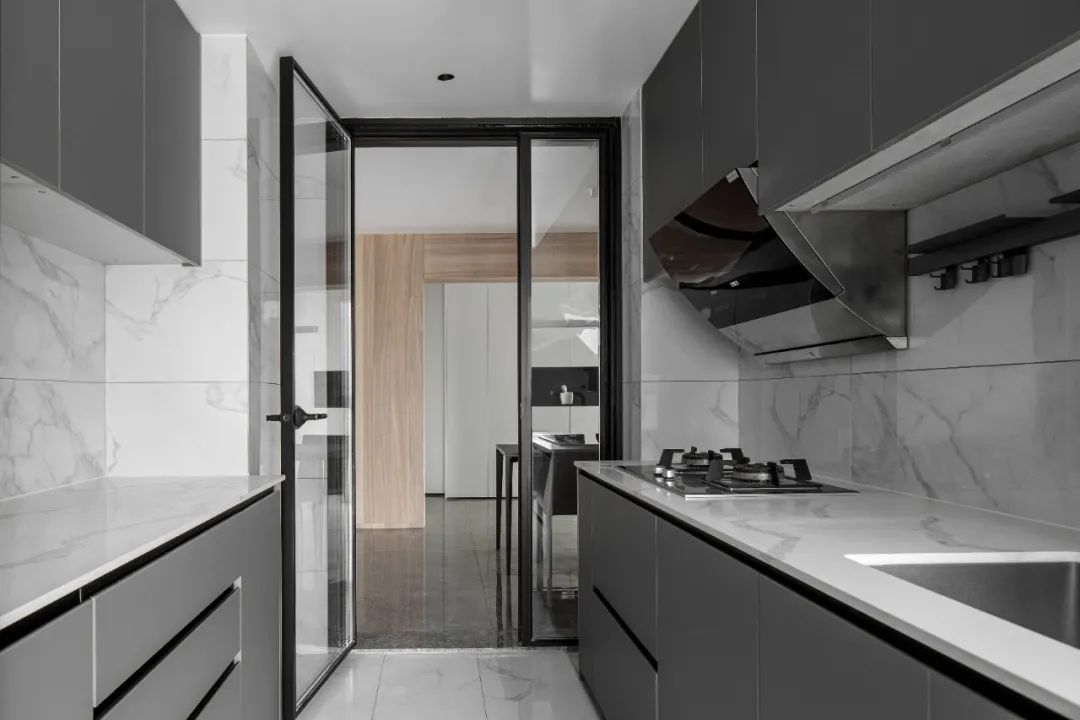
The kitchen still follows the black and white gray color scheme. The white marbled tiles are simple and easy to clean, and the gray cabinets are advanced. The closed kitchen lacks interactivity, and the pure glass sliding door ensures that the space is transparent and bright.
07
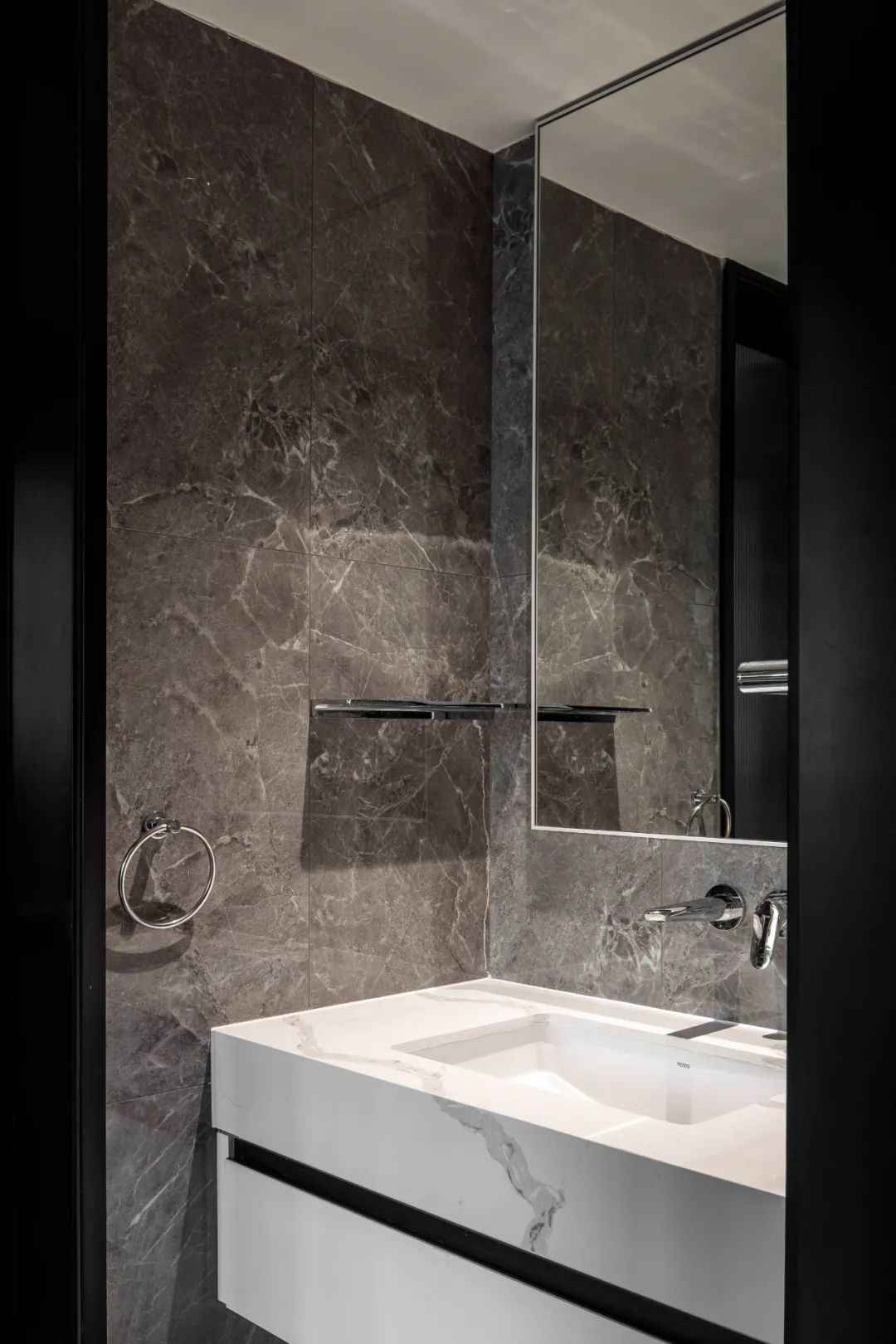
TOILET
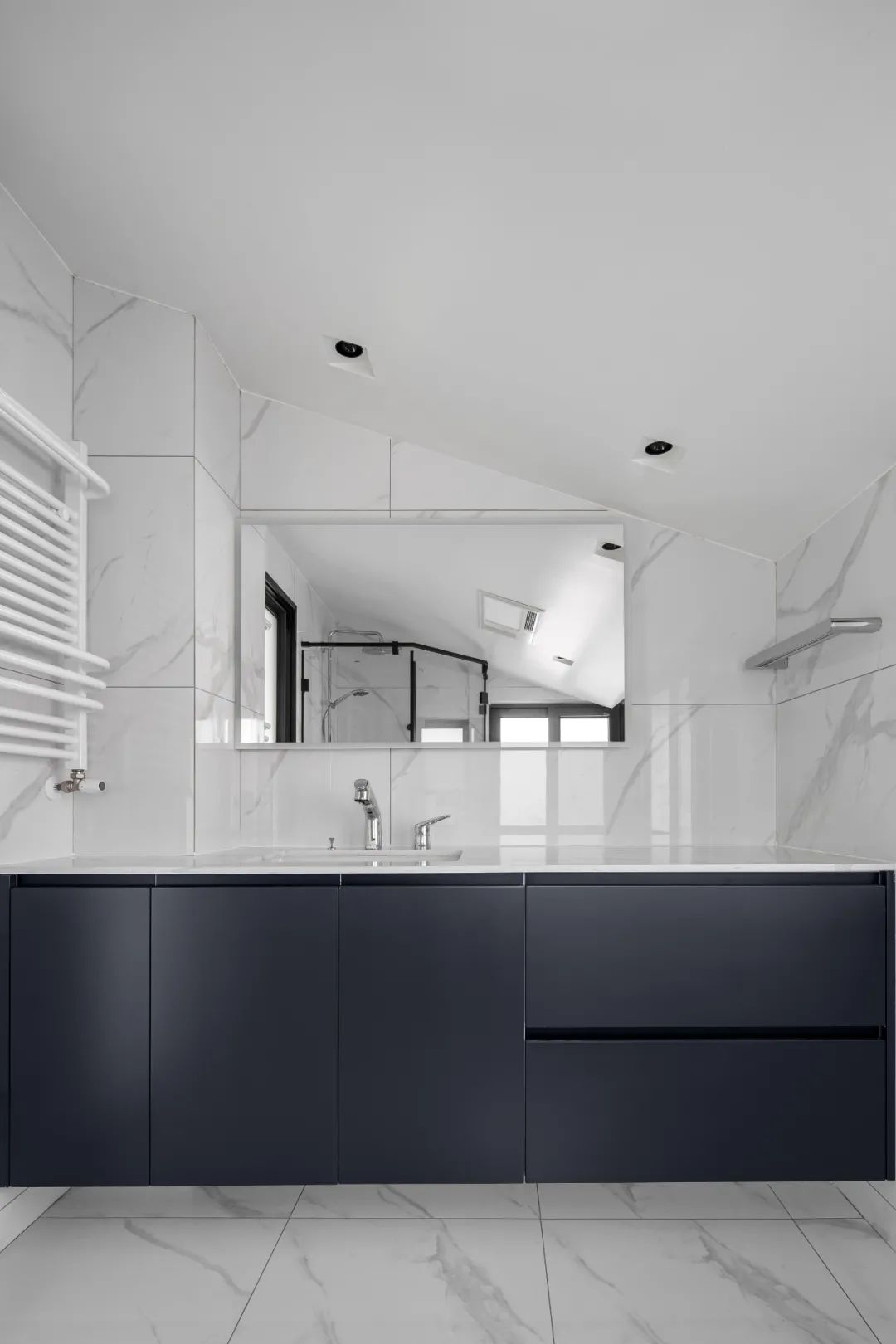
The overall lighting of the main bathroom is good, with the snow white marble tiles, refreshing and plain. The ink blue bath cabinet precipitates the overall space’s advanced temperament.
08
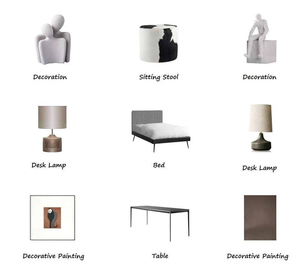
DECORATION LIST
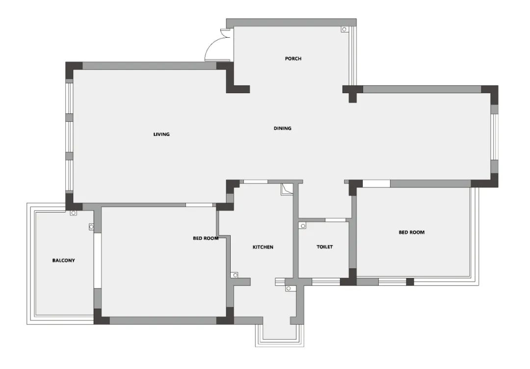
▲The original structure of the first floor
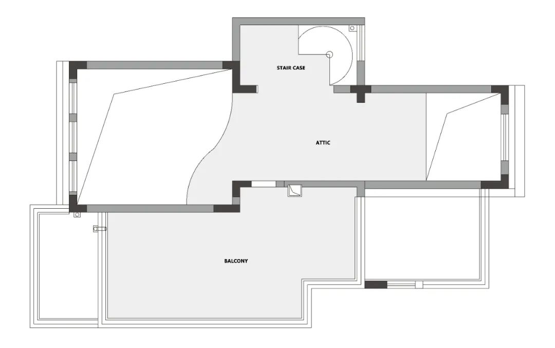
▲The original structure of the first floor
Original house type analysis
- There are many slanted roofs on the top.
- The rotating staircase at the entrance blocks the view and light, making the entrance very tight.
- The location of the original staircase caused a large area of wasted space.
- There is only one bathroom, which is a bit tight for a family of five.
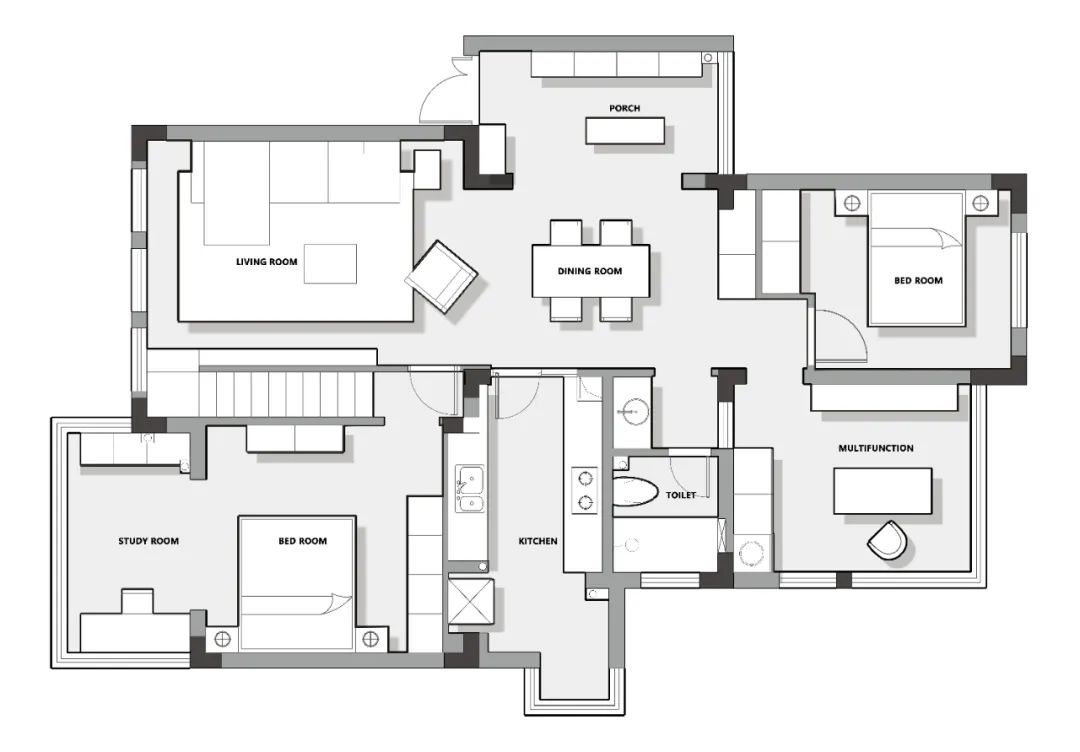
▲The first floor plan
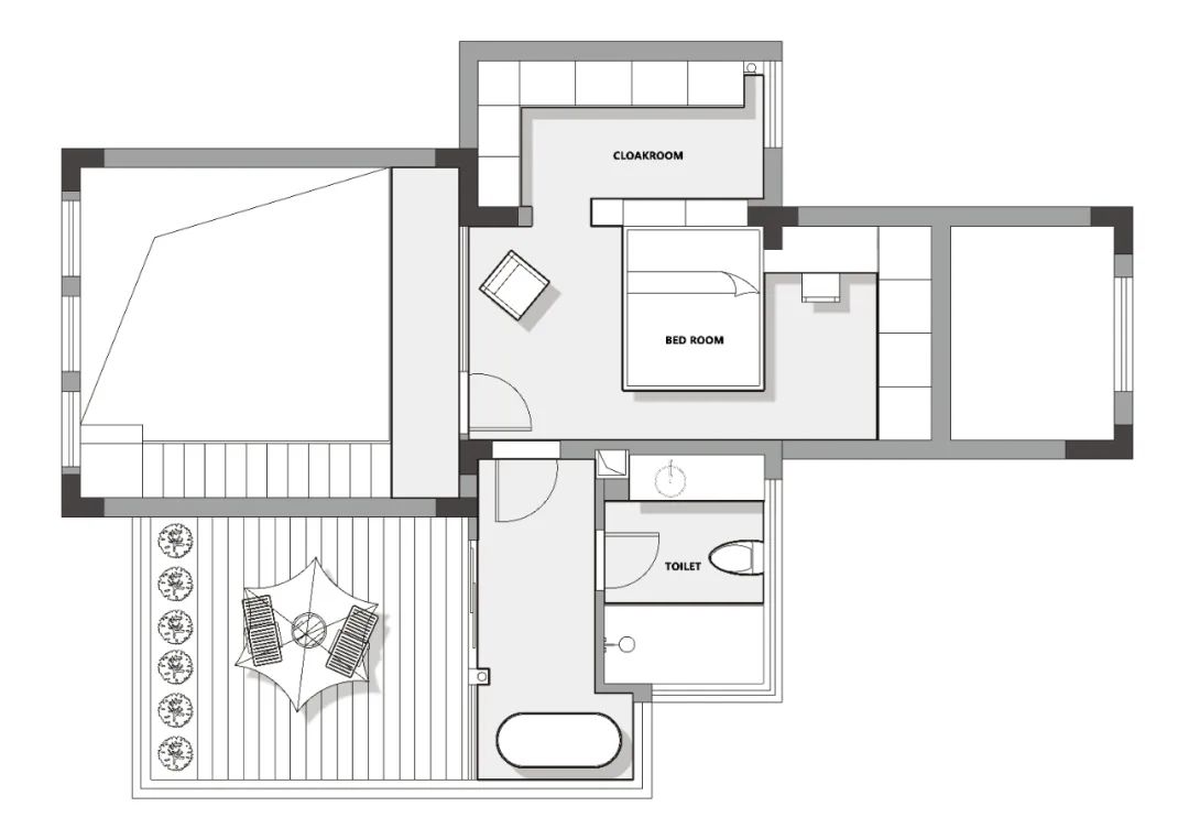
▲The second floor plan
The main points of transformation
- The original revolving staircase was removed to enlarge the entrance area, which is less blocked by the staircase and more light, making the entrance open and bright and also beneficial to the lighting of the dining room.
- The couple needed a more independent space, so the master bedroom was placed on the second floor. Using glass partition instead of brick wall, plus the half-height handrail of the corridor, let the light into the bedroom, and at the same time can form an interaction with the living room, so that the master bedroom does not look too isolated.
- After changing the staircase to the TV wall in the living room, the staircase handrail was extended downward, borrowing the staircase handrail to make storage space, and the handrail flanked the TV wall, so the space was not wasted.
- A small garden was made on the second floor to increase the space for recreation and entertainment.
- There is no bathroom on the second floor, so we chose to build a bathroom on the second floor to facilitate the use of the master bedroom, while retaining the location of the original window hole, so that the master bathroom is transparent and bright.
- The shaped platform between the second floor and the living room was changed to a rectangular one to enhance the unity of the whole space.
Area : 180m²
Atmosphere : Modern minimalist
Type : Three rooms, two halls, two bathrooms
Design Creator: Guanbai Design
Service Mode: Full project design
Project Location : Qingyang District, Chengdu
Construction : Guanbai Design & Construction Team
Guanbai
The word “Guanbai” is taken from a Zen poem. A fool can only see the heron, a wise man can see the snow, and a truly wise man will see the essence of heaven and earth as one, becoming a blanket of white.
The same is true for design, do not blind your eyes, explore the essence through the complex appearance, remove the essence, remove the falsehood and keep the truth, from the surface to the inside, from there to the other.
 WOWOW Faucets
您好!Please sign in